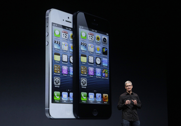
In its new avatar, the iPhone 5 is both sleeker (7.6 vs 9.3mm) and lighter (112 vs 140 grams) than the iPhone 4S. Instead of the delicate glass back, it now has aluminum back with glass inlays - making it both elegant and durable.
Apple has moved to an even smaller nano SIM and introduced a new smaller connector called Lightning to achieve the slimmer design. We had mixed feelings about the reduced slimness and weight of the iPhone. It stands up to Android competition , but it feels like a toy at times - far too light.
The new 4-inch retina display is stunning - it has a resolution of 1136 x 640 pixels - the largest of any iPhone. The new resolution also poses a problem: apps have to be updated to support it. At the time of writing, most apps were running in a letterbox mode (black bars on top and bottom). Thanks to the upgraded hardware, the phone is supersmooth with lightning fast response.
Apps load faster and switching between apps is a breeze. But (and this is a big but), iOS6 offers nothing substantially different. The user interface still looks the same (except the extra row of icons).

Two major new software features - Apple maps and Passbook are useless in India. Siri still fails to recognize an Indian accent properly. The highlight is the 8MP camera which takes surprisingly clean images even in low light, but the minimal camera settings are a letdown when compared to Android.
Battery life was just over a day - an improvement over the battery performance from the iPhone 4S. For a much lower price ( Rs 35,499), you can get Samsung's Galaxy SIII which has a larger 4.8-inch display, quad core processor, expandable storage, an equally good 8MP camera and similar battery life (all features, including free GPS navigation and S Voice work just fine).
Having said that, nothing can beat the app and accessory ecosystem of the iPhone. It's a tough choice.


Would love to here from you...